

Power and finesse.
Thick and thin. Chunky and delicate. The Manuka logotype is crafted with a high contrast font, to represent a brand with both style and substance.

Why Manuka?
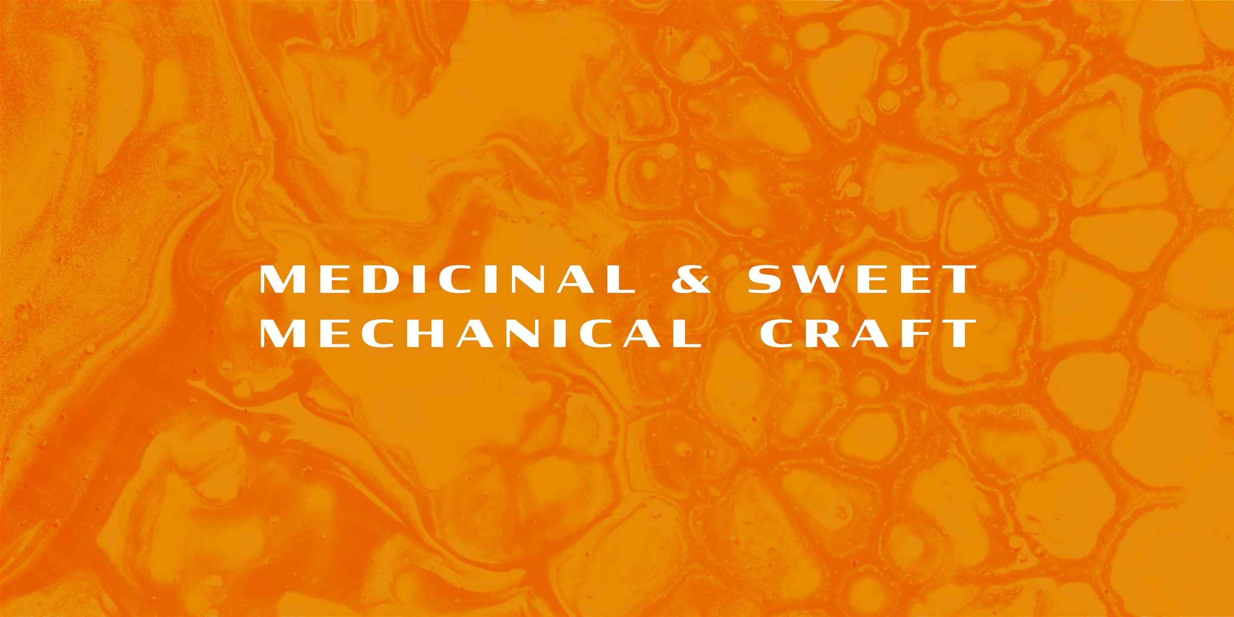
“It looks nice when you read it, sounds nice when you say it. And I think the bike reflects the Manuka plant, of which bees use to make Manuka honey, which is medicinal and sweet - just like riding a bike”
— Sam Farrar, Owner of Manuka Cycleworks


Liquid Gold
A colour palette to evoke the richness of Manuka honey itself, paired with the deep teal tones of dawn breaking over the hills as you ride at daybreak. The key brand colours contrast perfectly with each other, whilst the brand logo itself is flexible enough to be used in a variety of contexts.

Dynamic and flexible
The key logotype was intended for use on the downtube, so a short and wide format was the natural solution.


