


A new visual identity for online eco-conscious shopping brand Smallkind. Selling earth friendly products for busy families, the vision of Smallkind is to provide a curated selection of sustainable household swaps, source toys and gifts made to last, and share inclusive ways to better eco-living.
When Natalie briefed the project to me, it as clear that some of the values she wanted her brand to represent were already encompassed in the existing logo mark. The colours were incorporated into the new brand, while the overall clarity and composition were improved to provide a more friendly and welcoming feeling.
The images in the above photo are for reference and were not created by me.
We worked on a collaborative Pinterest board, and I established a clear picture for two distinct routes by we could evolve the brand. The above images are a collection called “play” which formed a visual brief for the new logo style.
The overall playful theme of the new brand concepts is represented not only by the colour palette chosen and the bespoke iconography, but also by the typeface selected. Stylistic alternates are available for some glyphs which means that, for appropriate use-cases, the letters can be a mix of styles and shapes - better representing a human approach to handwriting and the experience of learning to form letters as a youngster.
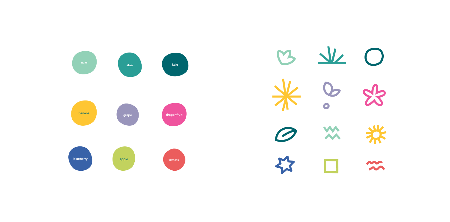
Repeat pattern tiles were designed for use across future packaging and playful marketing. These incorporate the bespoke icons designed for the Smallkind brand, and are flexible enough to use in a full colour or monochrome application.